Contributors: Jane Hoffswell, Wilmot Li, Leo Zhicheng Liu
Visualizations play a crucial role in how news organizations effectively communicate essential information to the public. An important aspect of journalistic reporting is to ensure that information is available whenever and wherever you need it. When you read content on your phone or a tablet, you expect it to adapt the layout to display information legibly regardless of the device you use. This behavior is fundamental in most of what we read, but creating a comfortable experience may not always be as easy as it seems. In our research, we tackle the challenge of creating responsive visualizations that adapt the content for users on a range of devices. This new work was recognized with a best paper award at the CHI 2020 conference.
Visualizations can be a great way to communicate and contextualize information. However, deciding how the design should adapt to different devices can prove laborious. To illustrate why responsive visualization design is so important (and so difficult), consider the following example. This visualization shows the monetary cost of major natural disasters to highlight the overwhelming impact of the top five mostly costly disasters in recent history: Hurricanes Katrina, Harvey, Maria, Sandy, and Irma. This visualization includes three separate designs that are swapped out depending on the screen size of your device.
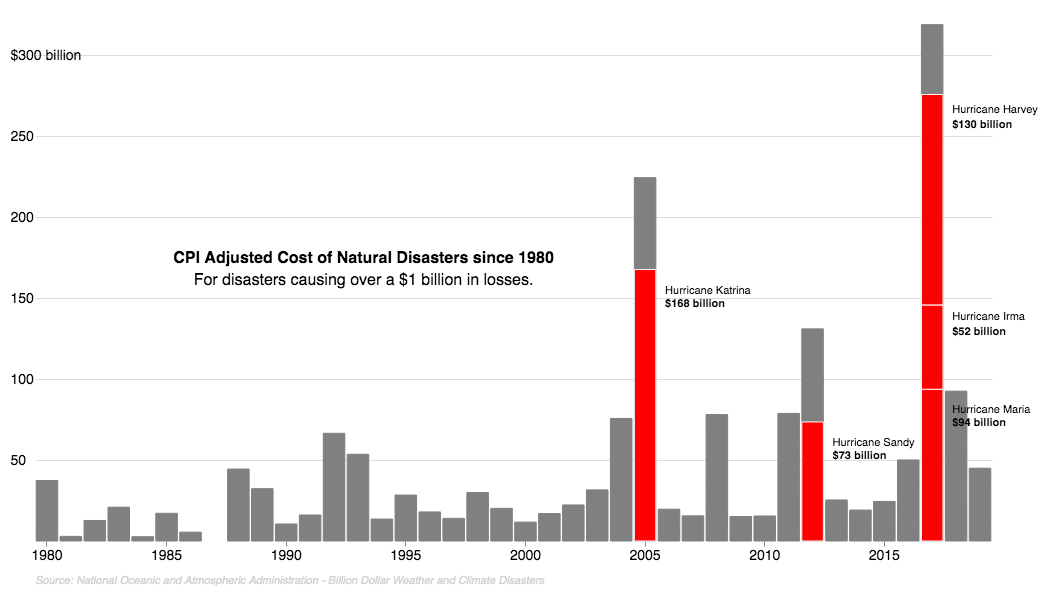
What device are you using to read this article now? To get a sense of the responsive functionality, try looking at it on a different device and notice how the content in Figure 1 adapts depending on the screen size you use. How many differences can you spot between versions of this chart? Take a look at the end of the article for our answer!
The main goal of a responsive visualization is to ensure that the content appears legible and remains informative regardless of which device a reader uses. By now you may be wondering how much these modifications really matter. We can answer this question with another example: compared to Figure 1, how does the design in Figure 2 perform on the device you’re using now? We would argue that Figure 2 is much worse. In general, visualizations designed for a desktop screen might not easily adapt to the smaller width of a phone. Simply scaling the image to a different size, as we’ve done in Figure 2, might make the text or visualization content too hard to read or otherwise visually unappealing.
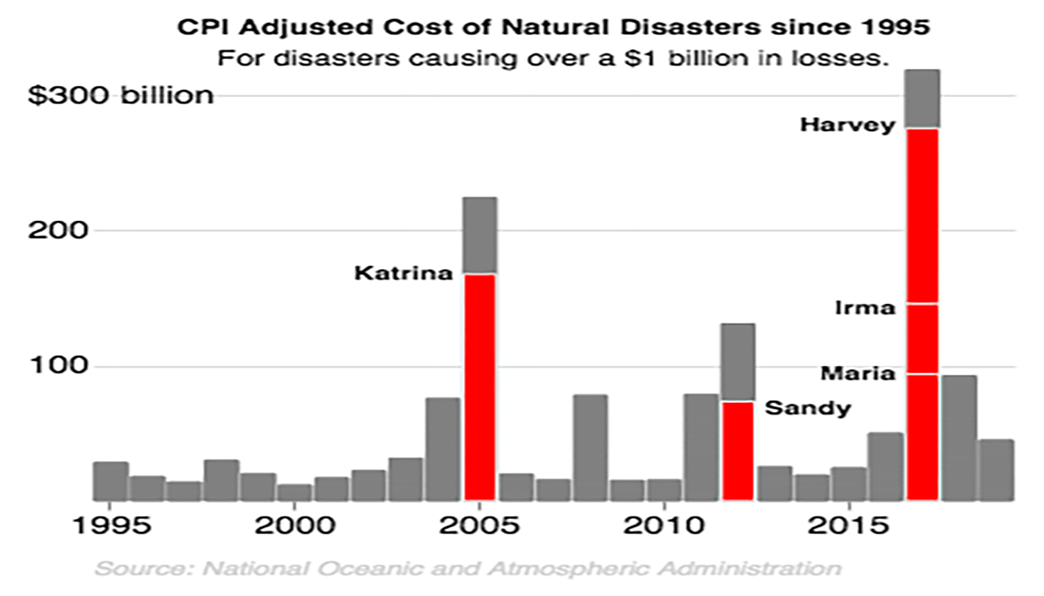
Together, Figure 1 and Figure 2 illustrate the responsive techniques and design trade-offs when developing a responsive visualization. Desktop computers present a larger canvas on which to explore complex or detailed information, whereas visualizations on mobile phones may need to reduce the amount of visible data and simplify the style in order to produce an effective design.
In our work, we aim to understand how people design customized visualizations that adapt based on the device size, similar to the example shown above. We then propose new techniques for an interactive visualization design system that better promotes responsive visualization design and supports a flexible development workflow.
We began by analyzing the techniques commonly used in online news articles; for example, we studied visualizations from major news organizations, including this map [link] and this chart [link]. We then interviewed journalists to gain further insight into their development processes.
After looking at many examples, we found that most designs employ a small number of changes, and primarily focus on removing details from the mobile version of a visualization. To produce responsive visualization designs, journalists tend to follow a desktop-first approach to explore the design potential on a larger canvas. They then finalize and adapt the content for the more constrained layout on a phone.
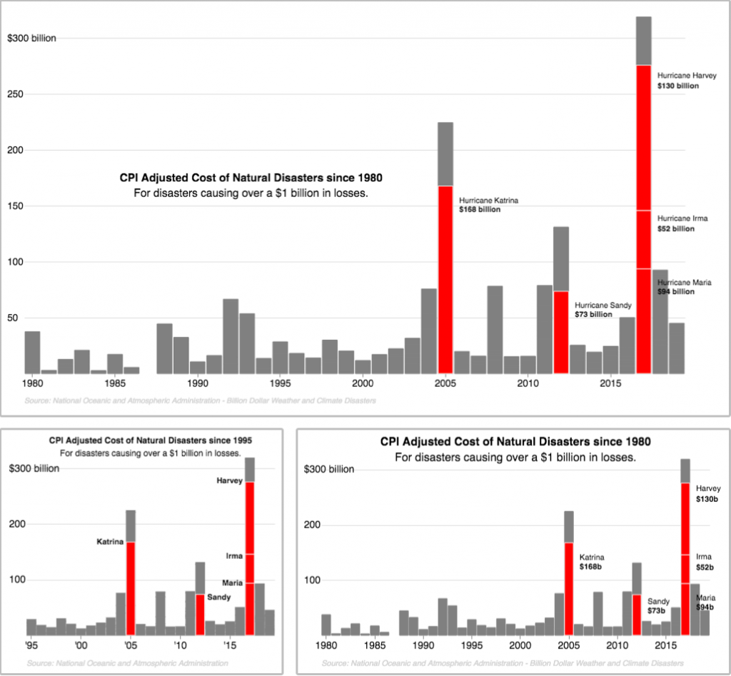
To produce responsive designs that adapt based on the device, designers often create separate versions of the same design for a pre-specified set of sizes and swap out the image based on which device is used (Figure 3). This approach is exactly the one that we are using in this blog post.
To develop separate versions of the visualization, the designer may simply copy-and-paste the first design, make changes, and save the adapted version. However, this process can be error-prone. Adapting a copy of the visualization may cause designers to introduce mistakes into subsequent versions, and any new changes to the design must be individually applied to each copy.
Our approach simplifies this process for designers by offering a canvas-based tool that allows designers to create and edit multiple visualization versions at the same time. This approach can help prevent the accidental introduction of errors by linking corresponding visualization components across versions of the chart. Our new visualization system supports a more flexible development workflow that allows designers to smoothly shift between local edits to an individual visualization and global changes across multiple designs.
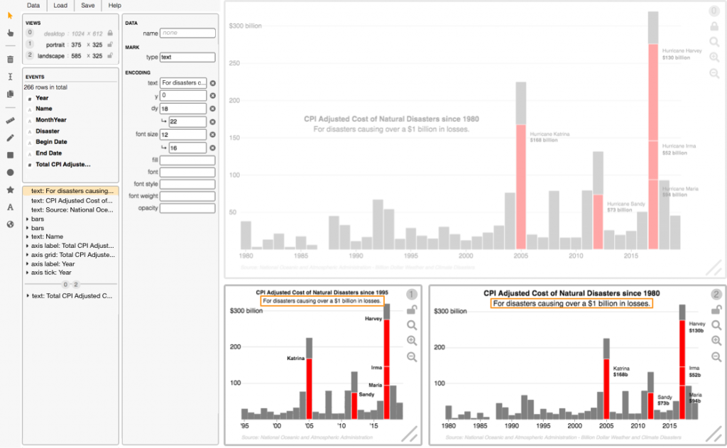
In our prototype visualization system (Figure 4), we display a separate canvas for each visualization version and allow designers to apply changes to all designs simultaneously. On the left of the interface are the system panels, from which the designer can control the number of visualization versions (a.k.a., views), view properties of the backing “events” dataset, inspect the layers of visual components such as the subtitle text, and customize the visual properties of the selected elements.
Designers can apply customizations to a particular visualization by locking or freezing other views to prevent future changes; for example, the desktop visualization has been frozen in Figure 4 to prevent changes to the position of the title and subtitle, which have been modified in the other two visualization versions.
To support designers in creating and managing multiple designs, we also display details of the design variation in the system panels. In Figure 4 for example, the subtitle has been selected and customized to increase the font size and text offset (“dy”) between the mobile and tablet visualizations. The layers panel (bottom-right) also shows variation in the types of visual elements that have been added to different views; for example, from this panel the designer can see that a text mark corresponding to the cost has only been added to the (0) desktop and (2) tablet visualizations. For a look at our system in action, check out our full demo video.
Our work “Techniques for Flexible Responsive Visualization Design” was published as part of the 2020 ACM Conference on Human Factors in Computing Systems (CHI), where it received a Best Paper Award for being in the top 1% of submissions. For more details about our approach, please take a look at our project video, the virtual presentation of this work, or our full paper.
Answer! Responsive Visualization Changes: How many differences can you spot between different versions of the chart in Figure 1? Our answer: 11! The following table lists the modifications applied to different components, with the unique functionality in each row highlighted. Notice that the tablet visualization does not exhibit many unique changes, and thus acts as a midpoint between the desktop and mobile designs.
| Responsive Component | Desktop | Tablet | Mobile Phone |
| Title position | chart area | top | top |
| Subtitle position | chart area | top | top |
| Title text | “… since 1980” | “… since 1980” | “… since 1995” |
| Data range | 1980-2019 | 1980-2019 | 1995-2019 |
| Label text: “Name” | “Hurricane Katrina” | “Katrina” | “Katrina” |
| Label font weight: “Name” | regular | regular | bold |
| Label align: “Name” | left | left | right + custom |
| Label position: “Name” | right of bar | right of bar | left of bar + custom |
| Label text: “Cost” | “$168 billion” | “$168b” | text removed |
| Axis step: “Cost” | 50 billion | 100 billion | 100 billion |
| Axis labels: “Year” | “2015” | “2015” | “‘15” |